Slightly modify the interface
Hi Everyone,
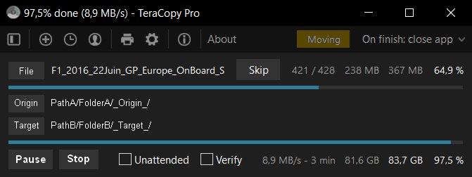
I often need to see the whole paths for either copying or moving, and it is very often not fully showing, because also the filename is shown on both origin and target (the filename will obviously be the same)
Also, it would be great to clearly see if we are copying or moving (different colors). Here moving is orange.
So it would be just awesome to change the interface to something similar to that :

Feel free to comment the post if you think it would be useful.
Cheers


Thanks for the reply.
Though could we choose to have linear or circular progress bars ?
Personally I find those circular ones too small and not very visible while it's probably the main information.
Also, no info about the "copying / cutting" mode I talked about in my post. Etc etc.
I guess I won't have my word in it but maybe you need a little survey before asking your devs to build that.
Cheers